

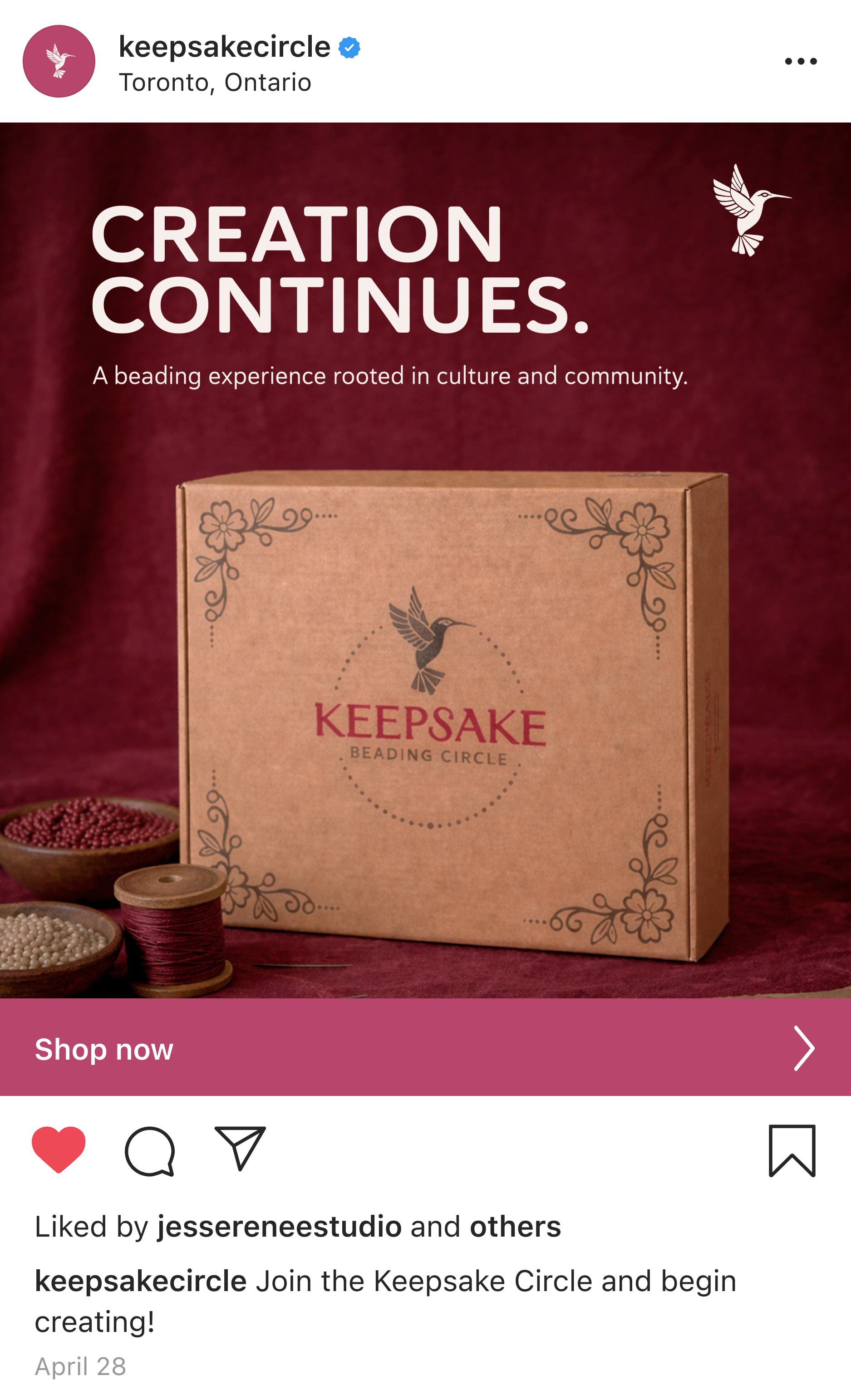
KEEPSAKE BEADING CIRCLE
Creative Direction, Brand Identity, Packaging, IllustrationA culturally grounded subscription experience designed to share and continue Haudenosaunee culture through traditional beadwork. Combining a digital beading circle with curated material kits, it creates space for community, learning, and connection across distances.

A shared space for guided learning, connection, and progress wherever you are.
THE KEEPSAKE CIRCLE
THE CONCEPT
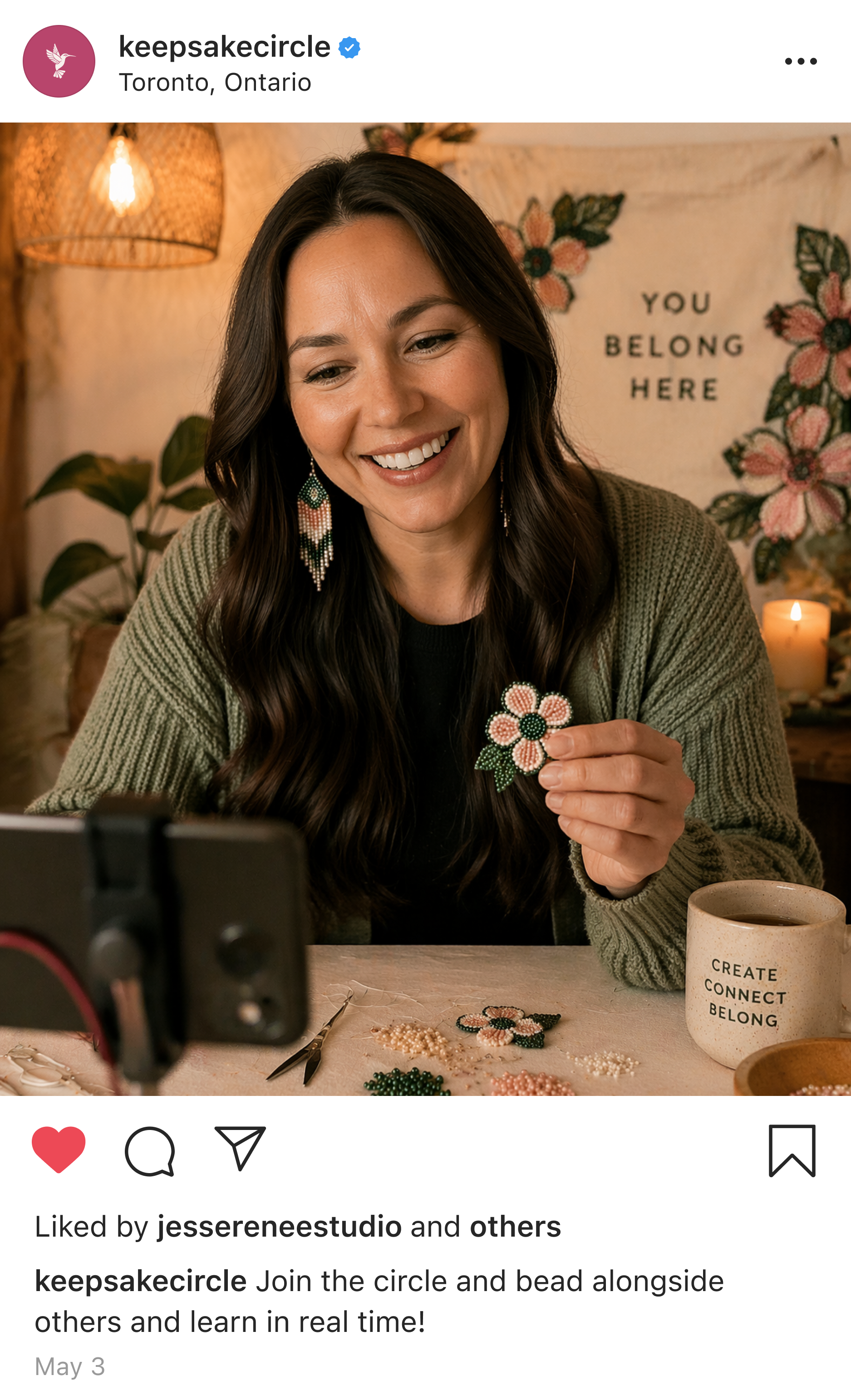
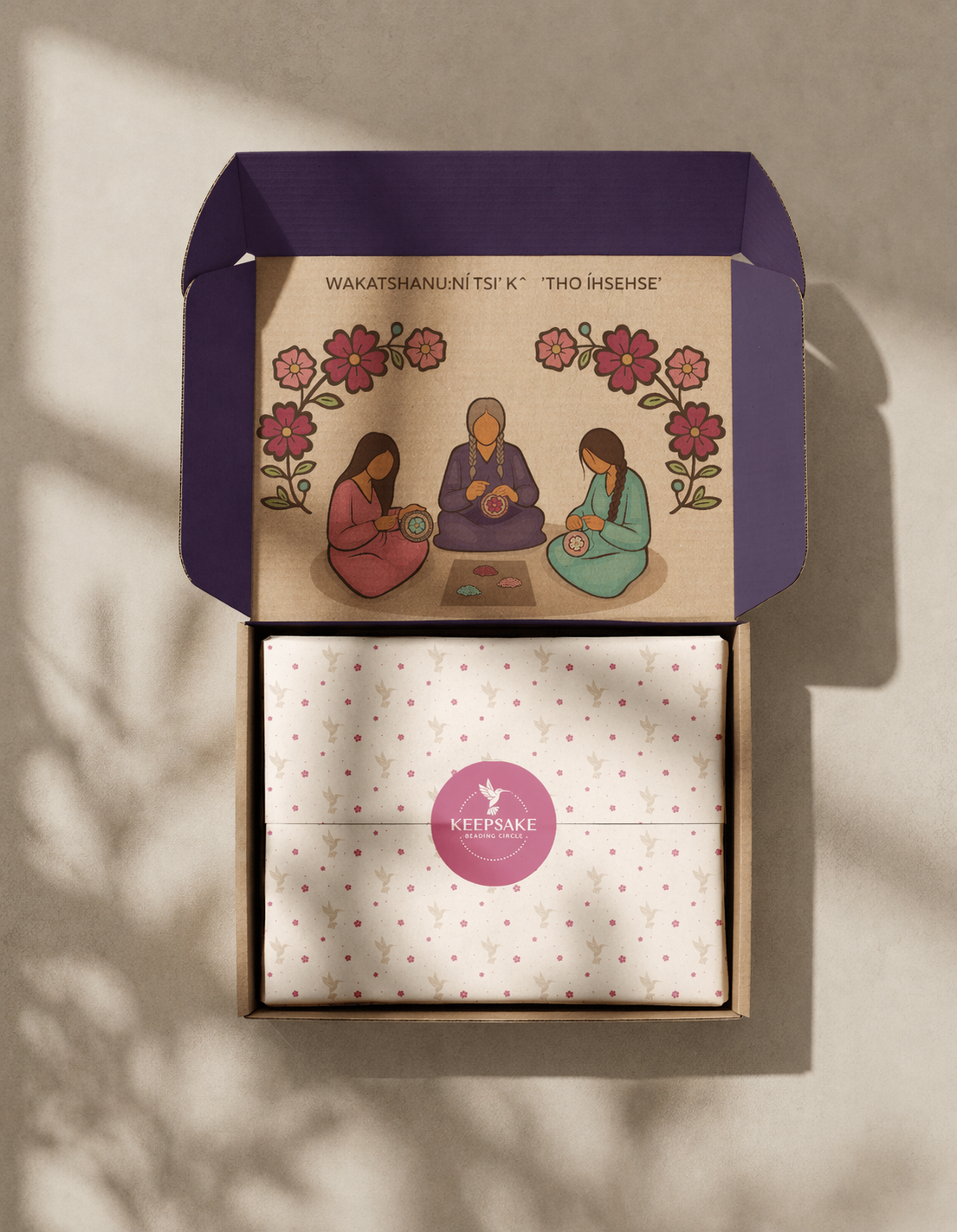
KEEPSAKE is a hybrid learning experience designed to reconnect people to traditional beadwork through guided learning, curated materials, and community-centred design. Combining a digital platform with a subscription box, the project creates space for participants to learn, create, and reconnect with culture at their own pace.
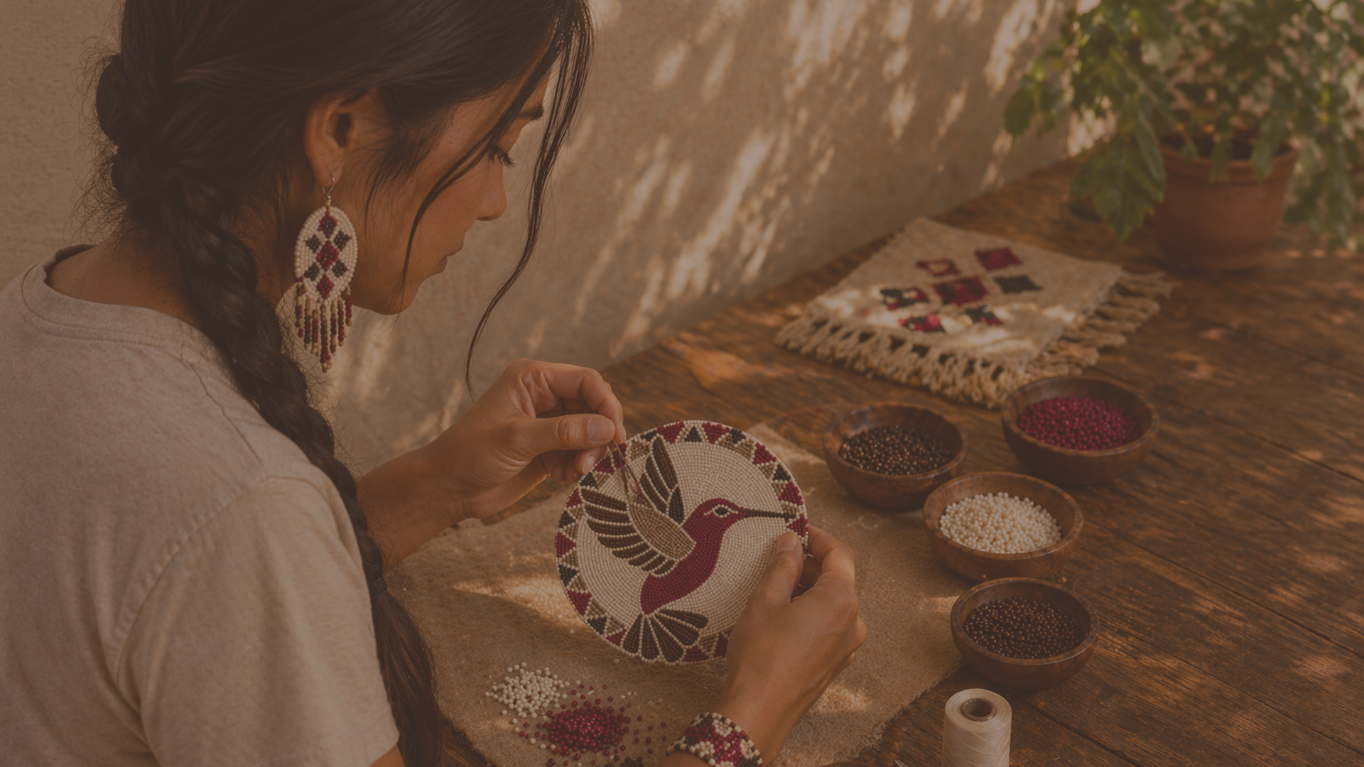
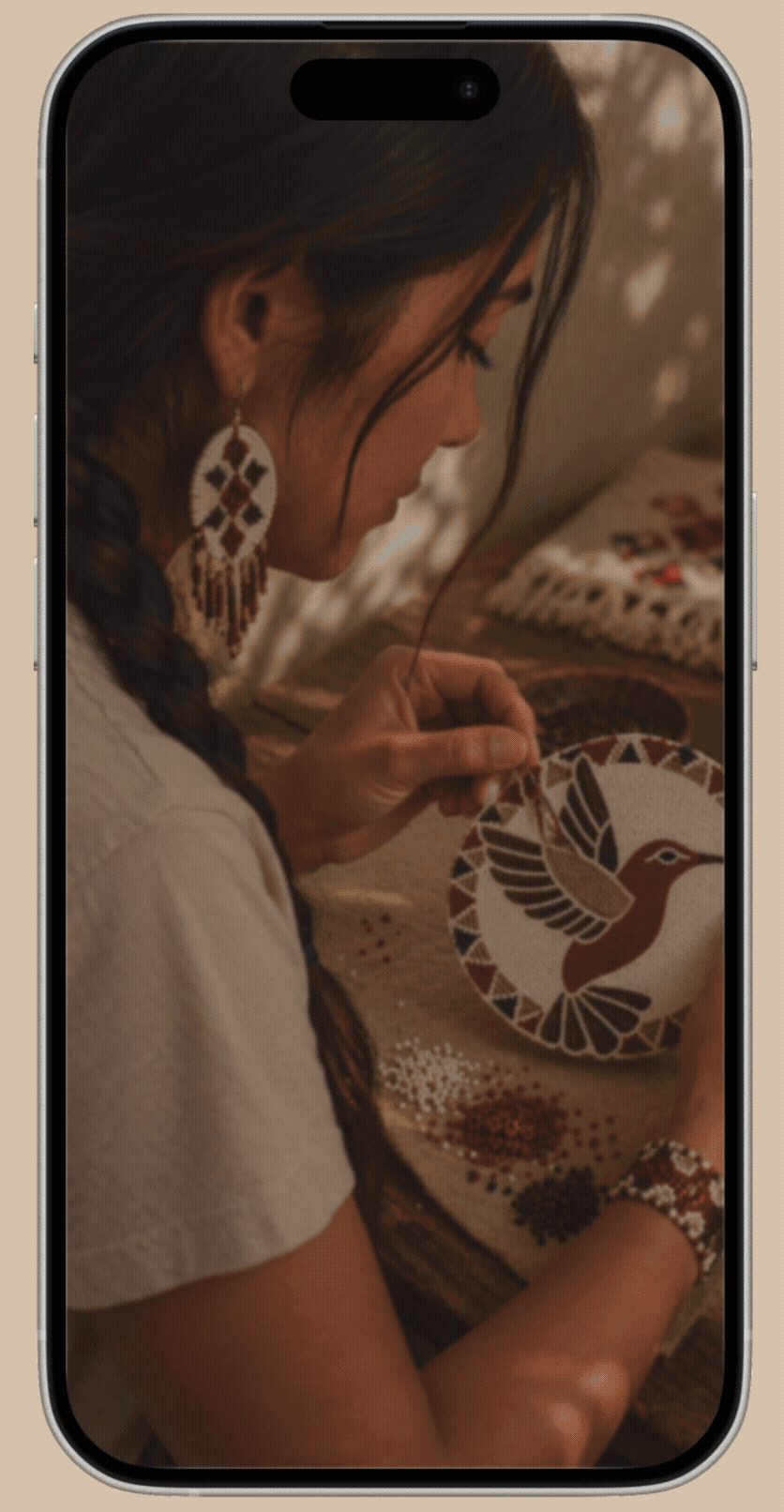
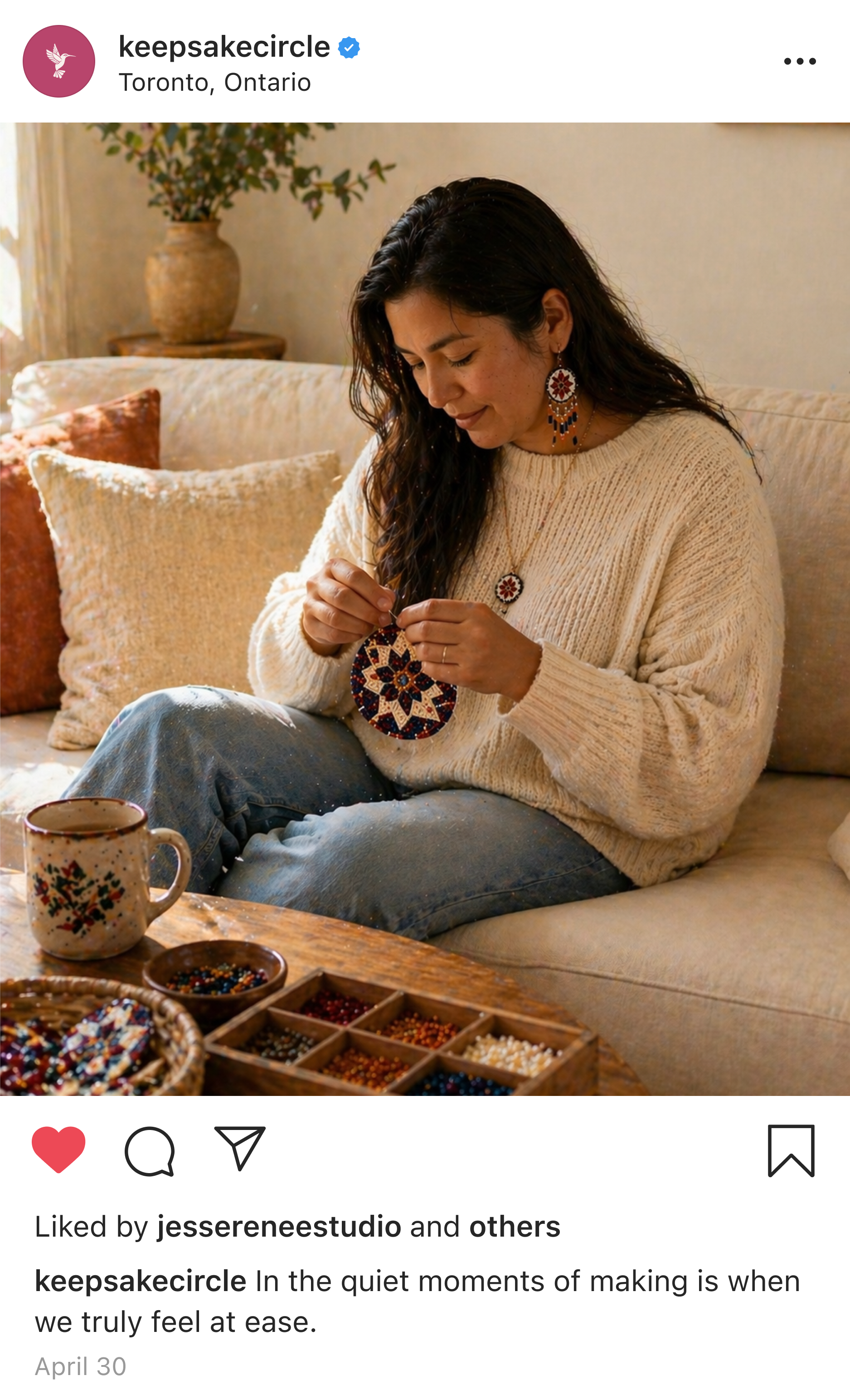
Inspired by the quiet process of beading itself, KEEPSAKE explores how creating can carry memory, identity, and connection.
CULTURAL CONTINUITY
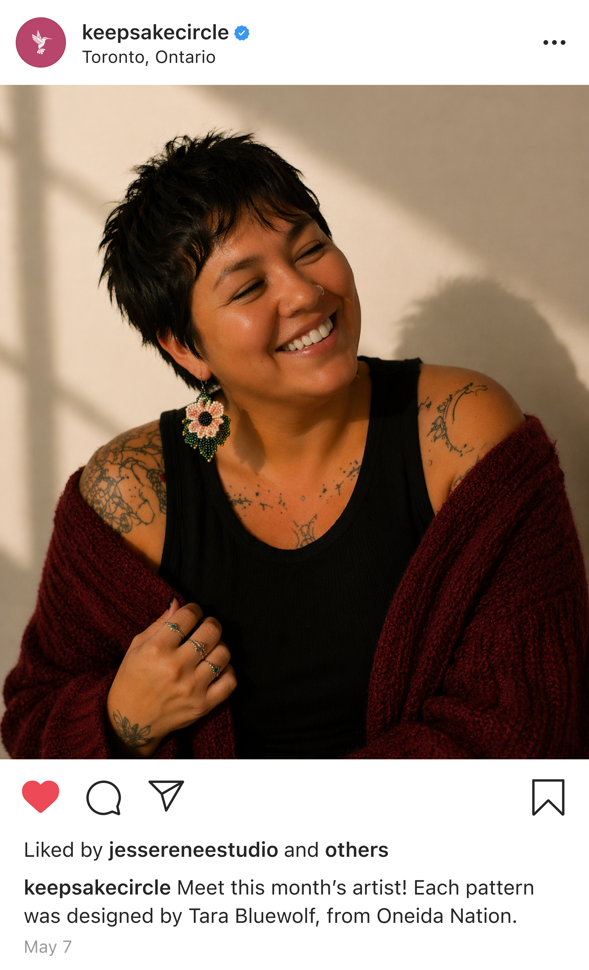
Haudenosaunee culture has endured through generations despite assimilation and ongoing attempts to disrupt it. Through resilience, intention, and community, cultural knowledge and traditions have continued through stories, teachings, and shared experience. Beadwork exists within that continuity. It is a sacred practice that holds stories, memory, and identity, learned through patience, observation, and time spent in community.
Culture cannot survive on its own. It lives through people, through teachings, and through the act of passing it on.
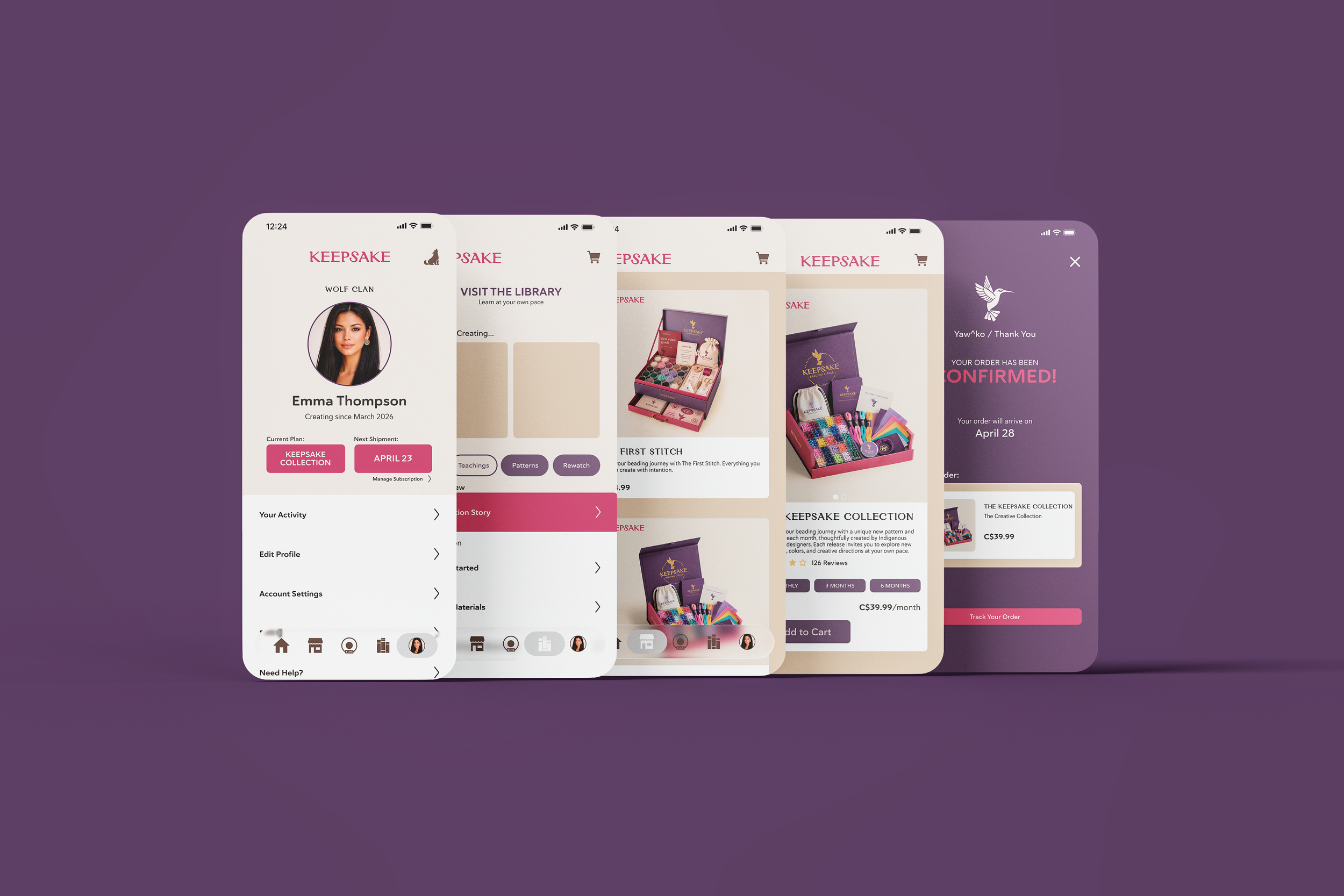
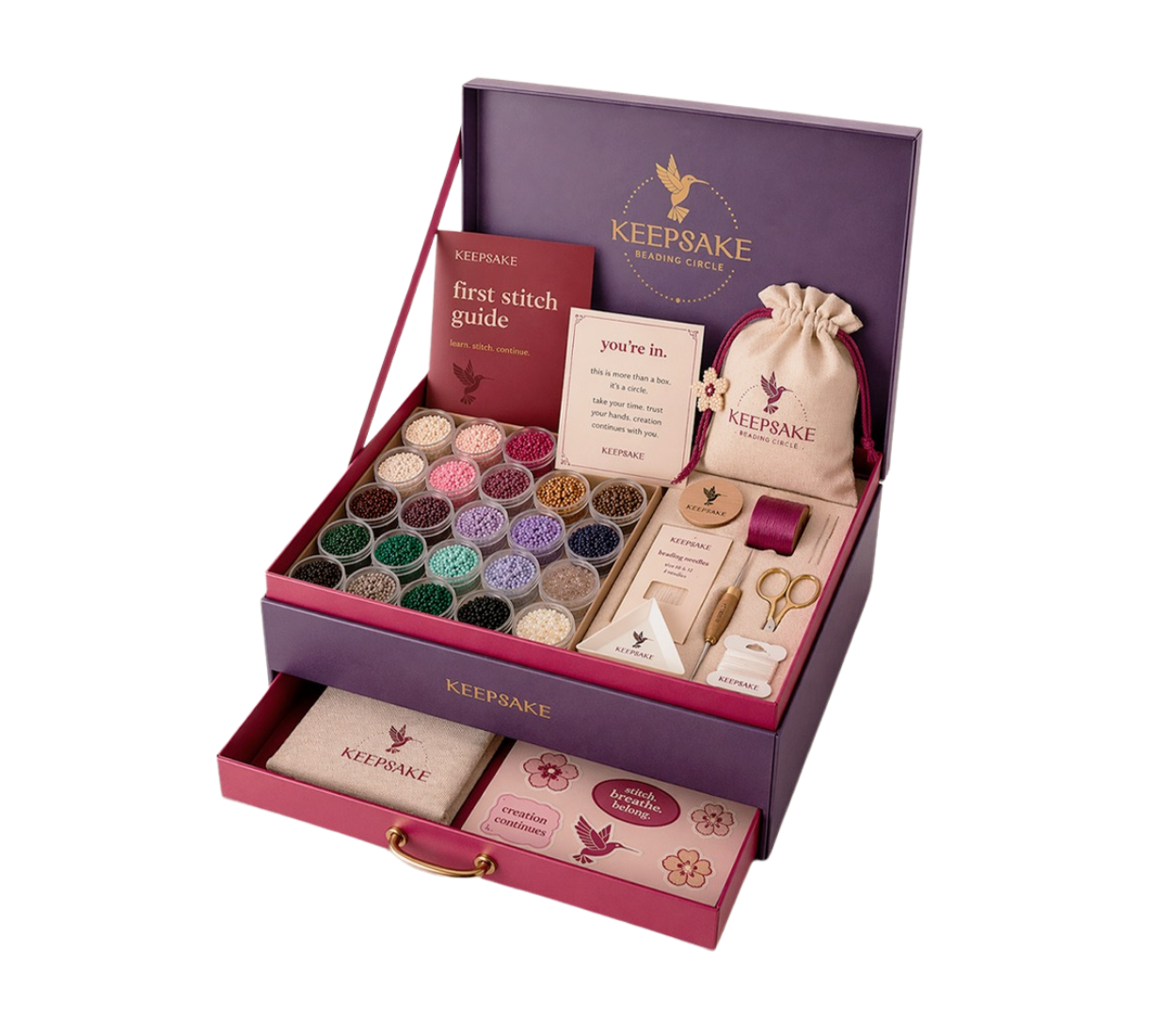
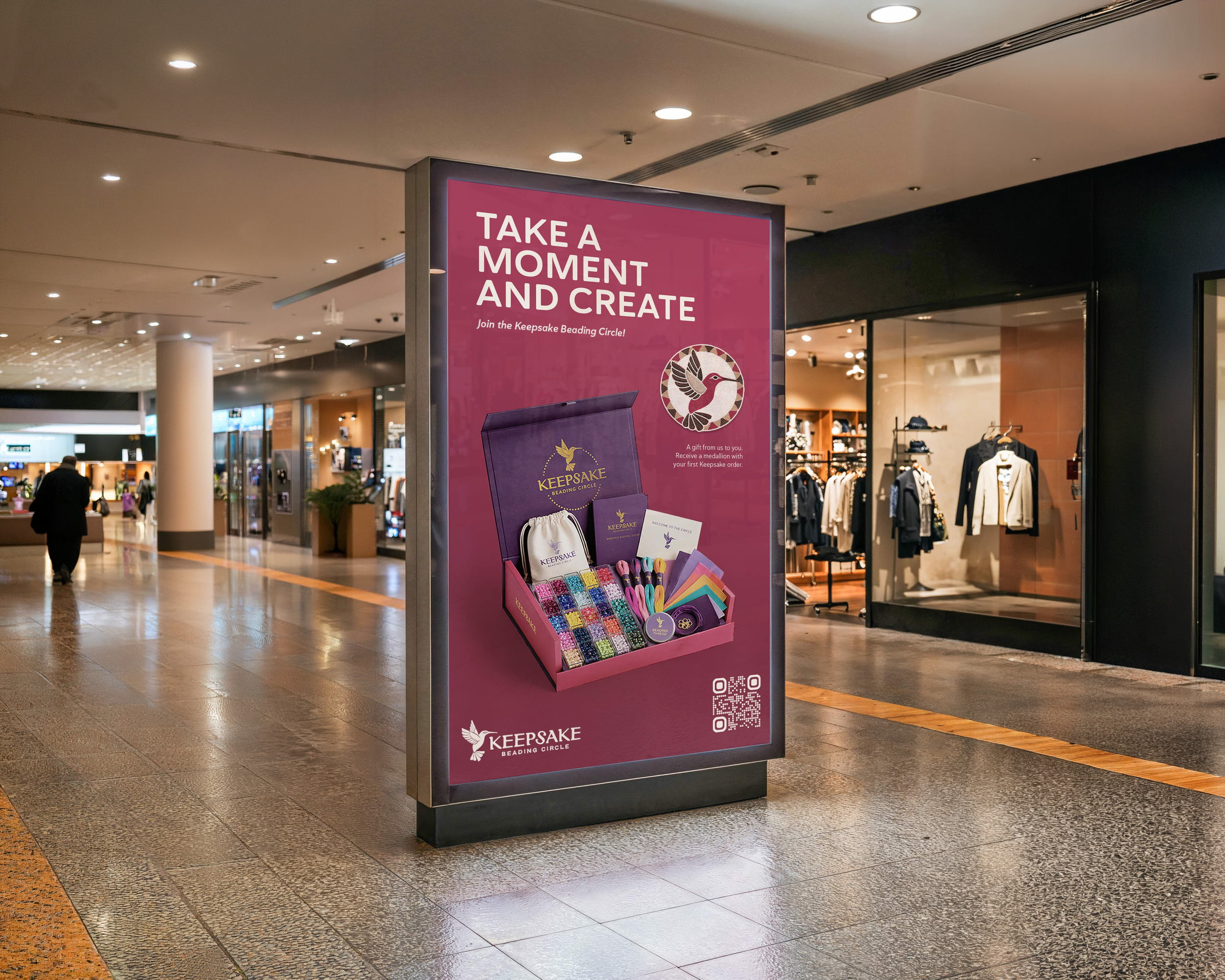
THE COLLECTIONS
Each collection has been thoughtfully designed to support different stages of learning, creating distinct and approachable pathways from first introduction to deeper practice.
The First Stitch
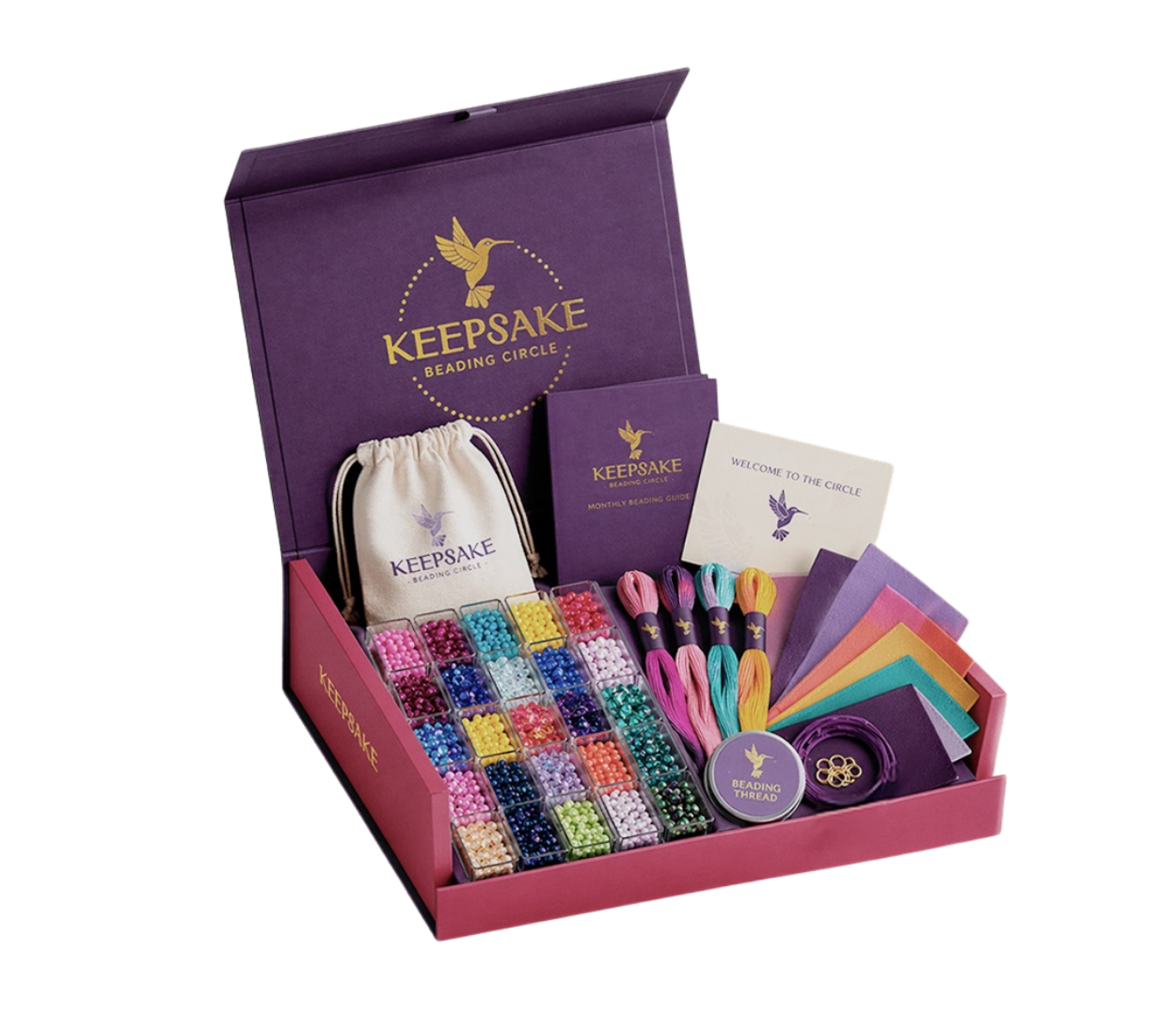
The Keepsake Collection
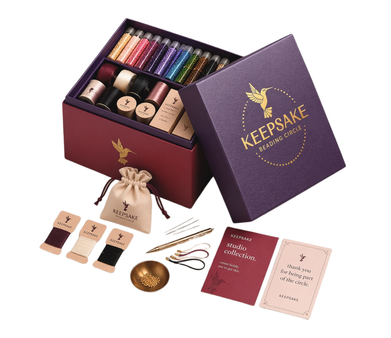
The Studio Collection

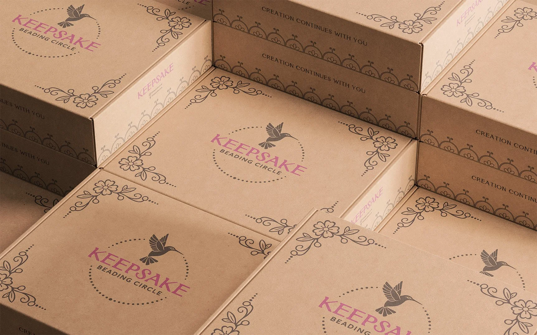
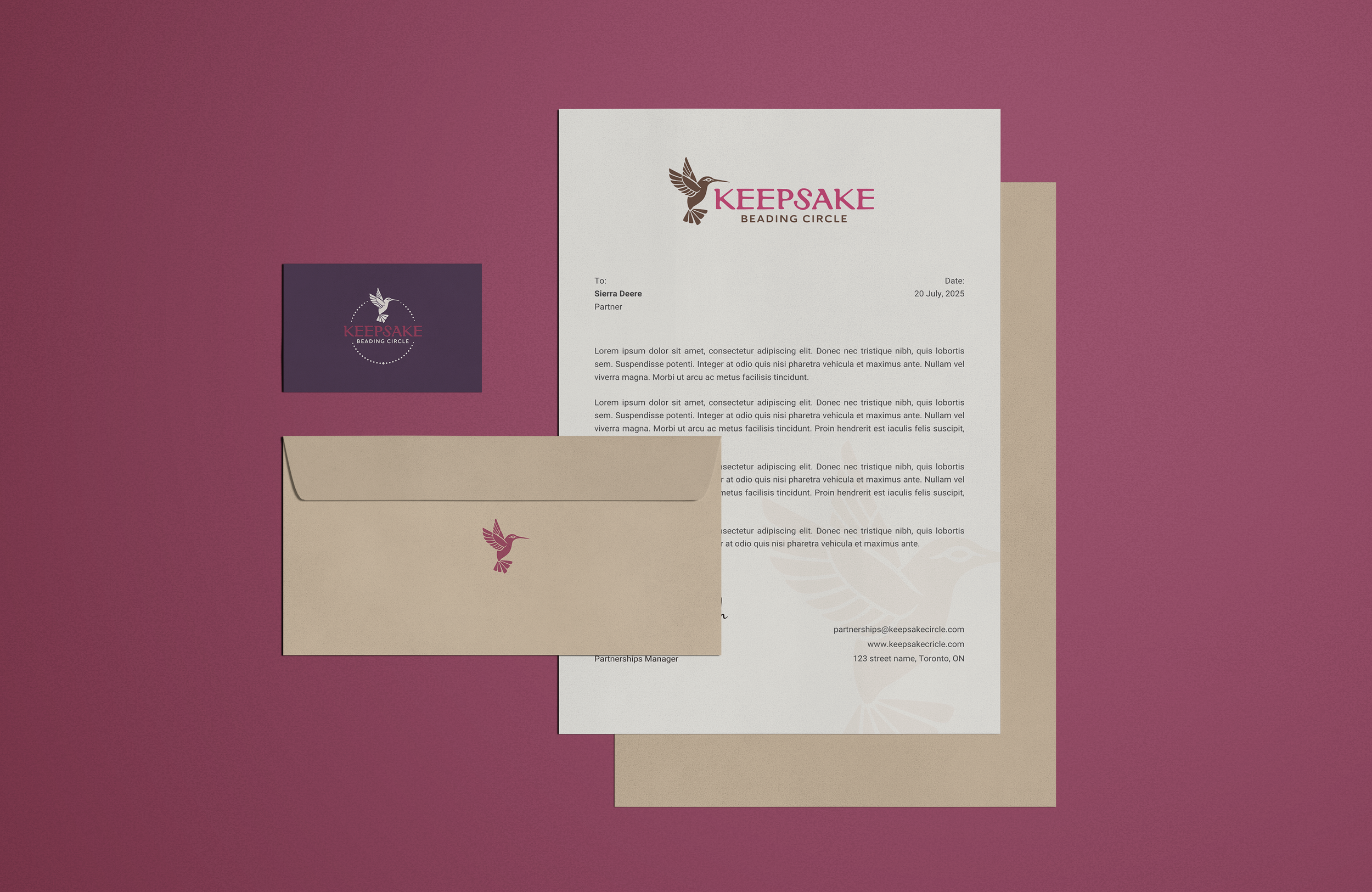
THE LOGO SYSTEM
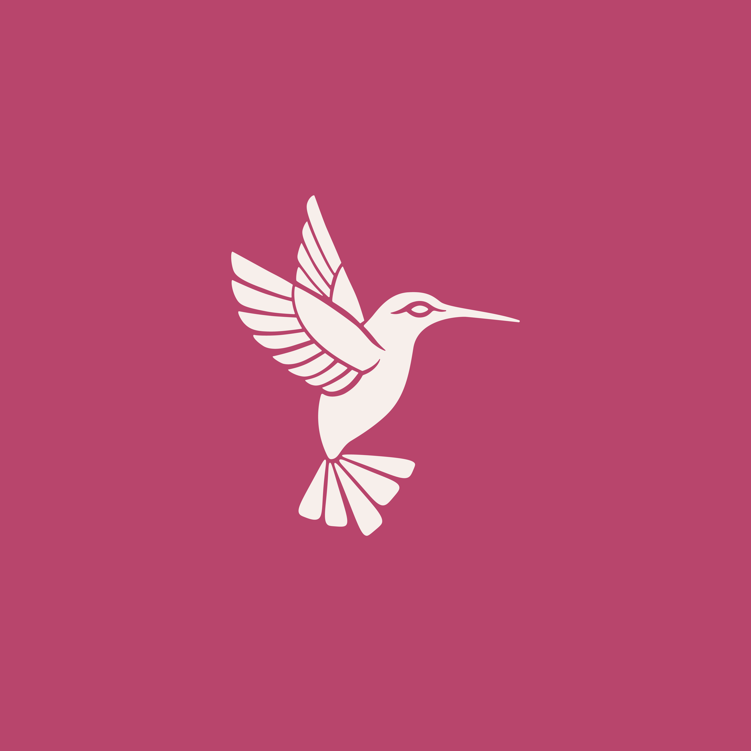
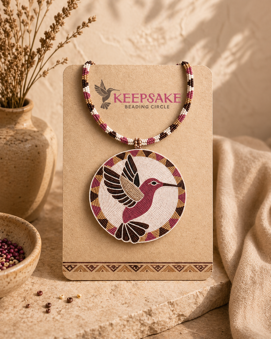
The Keepsake logo system is built around connection, continuity, and shared experience. The hummingbird represents peace and presence, while the surrounding beaded circle reflects individual stories coming together as a collective.
Paired with a clear, approachable wordmark, the system balances meaning with usability, allowing the brand to remain recognizable across both digital and physical spaces.
Secondary Mark
Workmark
Icon
THE COLOUR PALETTE
The colour palette is designed to reflect the balance and intention behind Keepsake. Soft, muted tones create a sense of ease and approachability, while deeper shades provide grounding and stability across the system. A central berry tone introduces contrast and energy, acting as a focal point within the palette. Together, the colours support a visual language that feels calm, connected, and rooted in the rhythm of making.


-
![]()
Keepsake Medallion
-
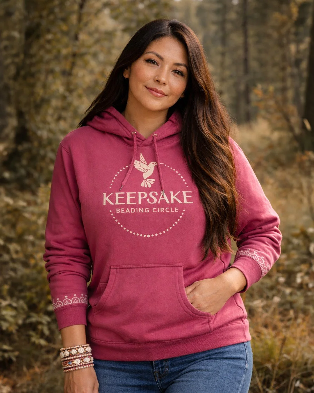
![Wild Berry Hoodie]()
Wild Berry Hoodie
-
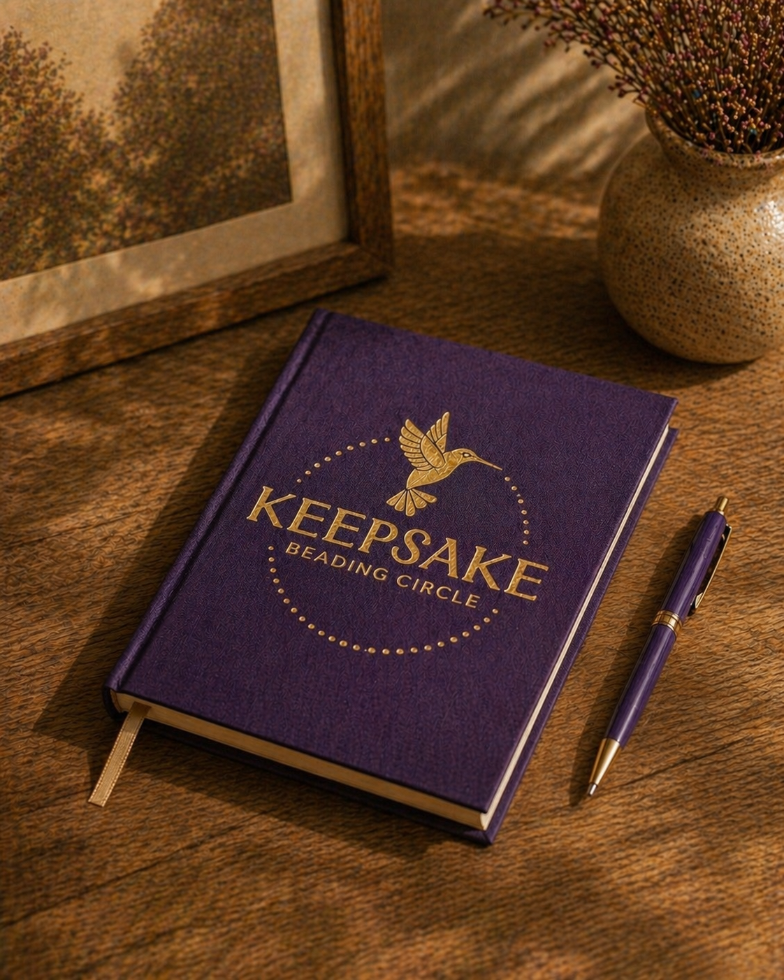
![]()
Keepsake Journal
-
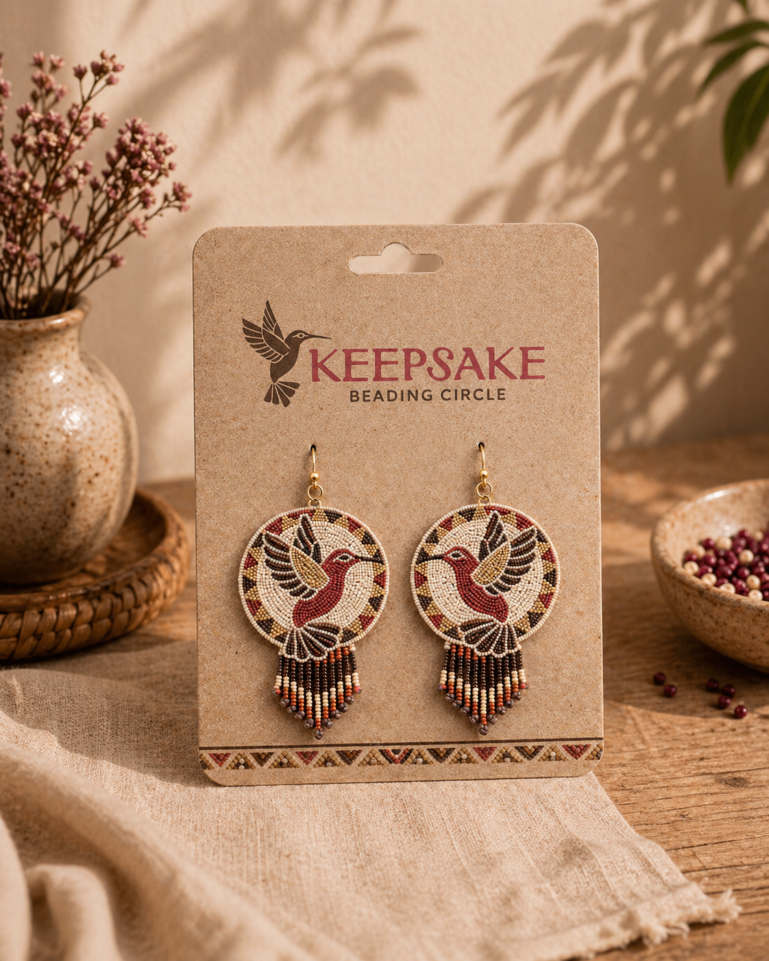
![]()
Keepsake Beaded Earrings
-
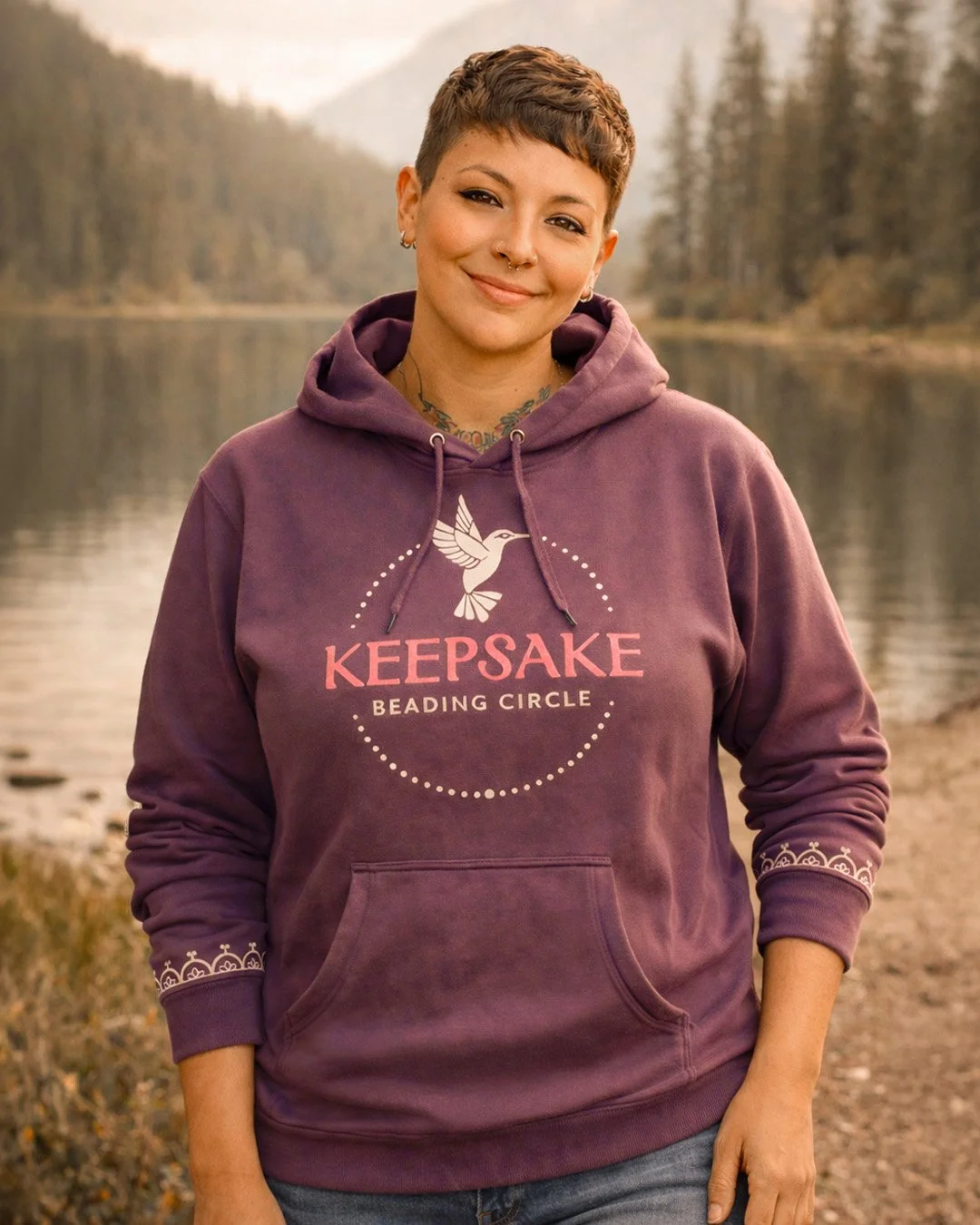
![]()
Elderberry Hoodie
-
![]()
Keepsake Mug

Culture continues through the act of sharing.
Keepsake exists as a way to carry this knowledge forward.
Adobe Illustrator, Adobe Photoshop, Figma, Gemini
SYRACUSE UNIVERSITY | VIS 627 - Branding System